reschola and charts
This document assumes two things:
- charts are made in ggplot2
- you have a fair understanding of ggplot2, so this is not a guide to using that package.
It also does not reiterate the principles of data visualisation, though it does point to some resources in that vein.
The reschola theme
Global theme setting
You can set the theme for your whole Rmarkdown document (or session,
for that matter) by putting theme_set(theme_schola()). Then
you don’t need to add it to your plots. As theme_schola()
has parameters which you are likely to need, this seems impractical and
anyway could be confusing.
Basic usage of theme_schola()
reschola contains the theme_schola() theme,
which has
- sensible defaults so you are not forever changing the same parameters
- some aesthetic choices custom for Schola Emppirica
- good default fonts
The examples below serve as (a) guide to the parameters of the theme, (b) test, and (c) showcase.
Resolution and sizes can be off on this page. The templates contained in this package are optimised to produce great looking and properly sized charts in Word documents.
First, let’s see the default plot, no theme
p <- ggplot(mpg) +
 geom_bar(aes(y = class)) +
 labs(title = "Lots of cars", subtitle = "Count of numbers")
p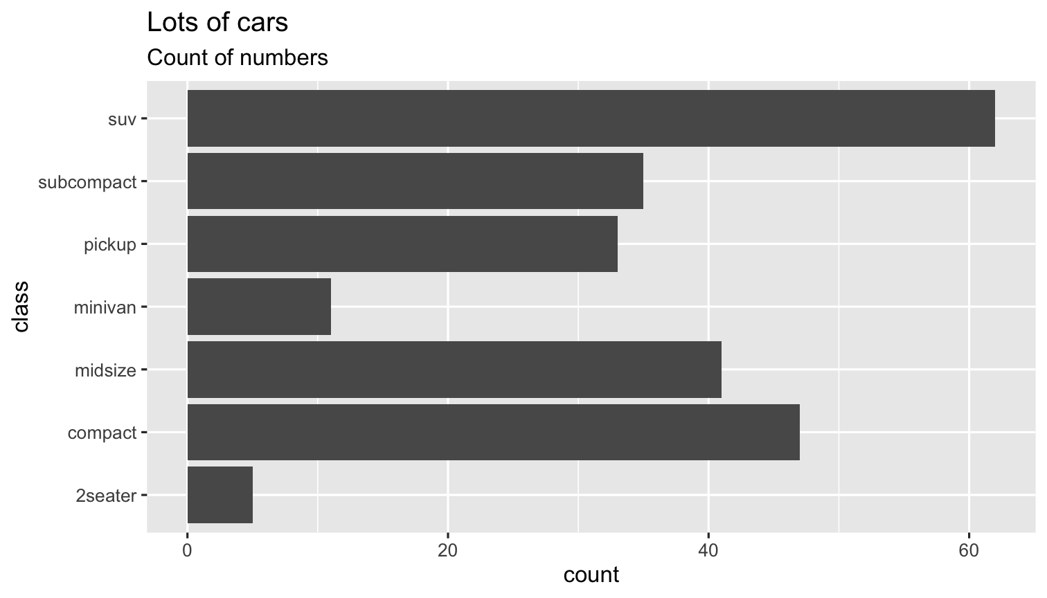
Now let’s see what theme_schola() defaults do
p +
 theme_schola("x") # only setting the first parameter to get the right gridlines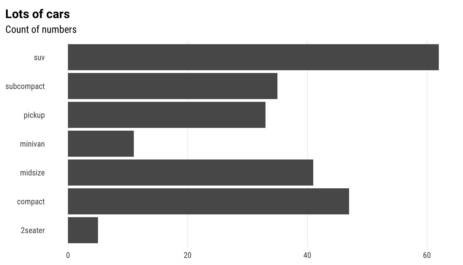
in combination with flush_axis
p +
 theme_schola("x") +
 scale_x_continuous(expand = flush_axis)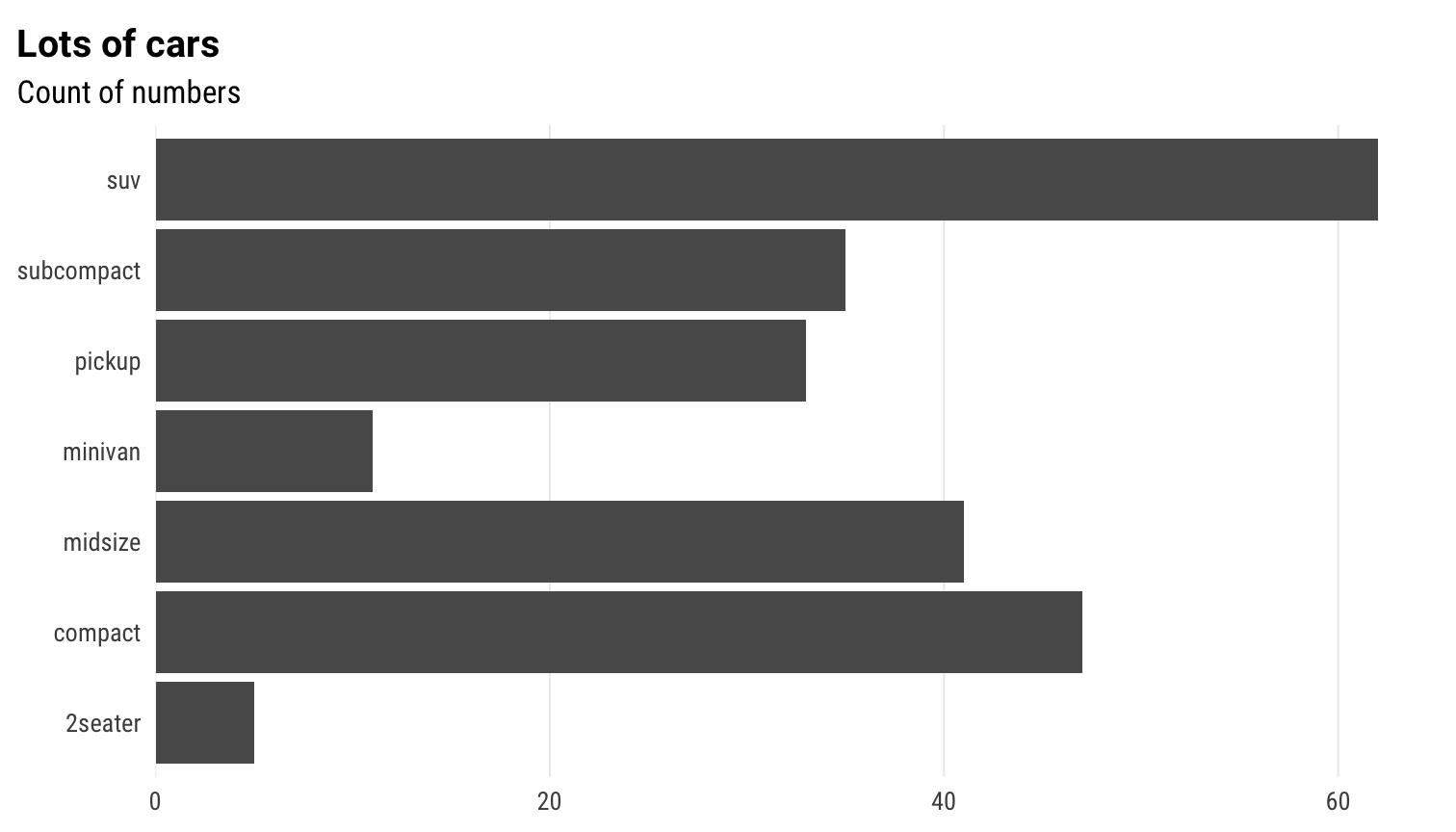
Scatterplot
ggplot(mpg) +
 geom_point(aes(cty, hwy)) +
 theme_schola("scatter") +
 labs(title = "Lots of cars", subtitle = "Point by point")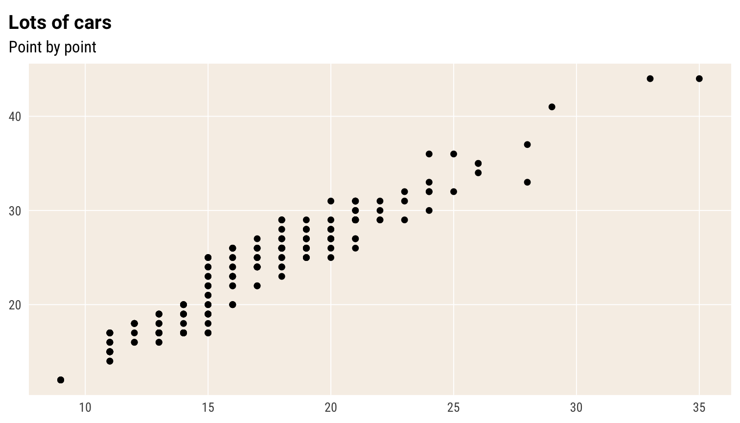
Smaller text, flush plot alignment
ggplot(mpg) +
 geom_point(aes(cty, hwy), alpha = .2) +
 theme_schola("scatter", base_size = 9, margin_side = 0) +
 labs(title = "Lots of cars", subtitle = "Point by point")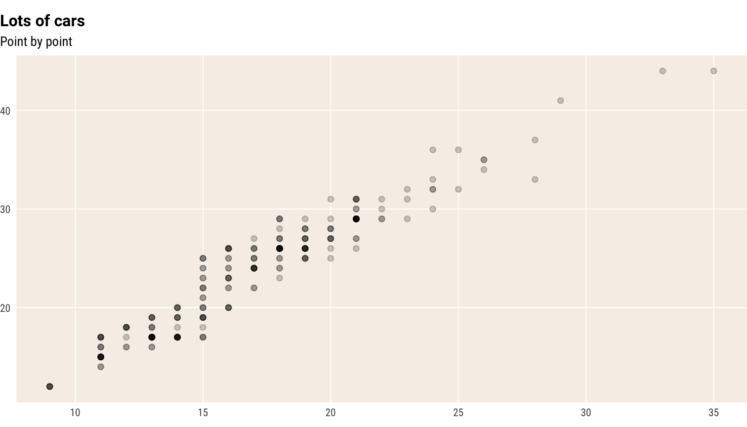
If you are adding a caption in your Rmarkdown chunk, you may also
want margin_bottom = 0 to cut the bottom margin in the plot
and move the caption closer to the plot.
Override defaults changed inside theme_schola()
ggplot(mpg) +
 geom_point(aes(cty, hwy), alpha = .2) +
 theme_schola("scatter", base_size = 12, margin_side = 0) +
 labs(title = "Lots of cars", subtitle = "Point by point") +
 theme(panel.background = element_rect(fill = "lightpink"))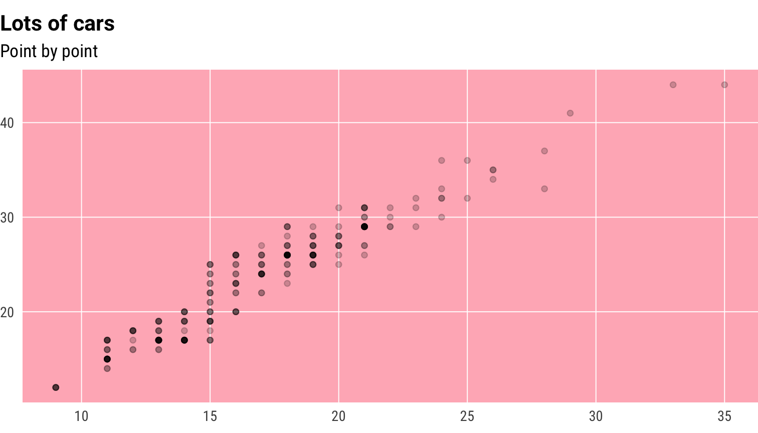
Small mutliples
p +
 theme_schola("x", multiplot = T) +
 scale_x_continuous(expand = flush_axis) +
 facet_wrap(~ manufacturer, nrow = 2)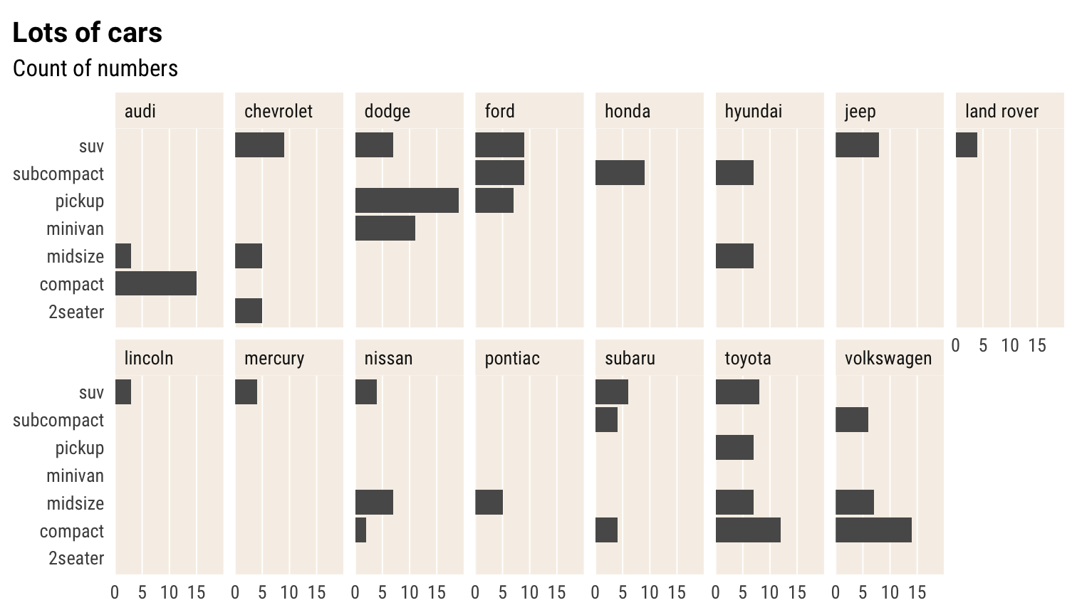
Same without aesthetic adjustment for facet_wrap()
p +
 theme_schola("x", multiplot = F) +
 scale_x_continuous(expand = flush_axis) +
 facet_wrap(~ manufacturer, nrow = 2)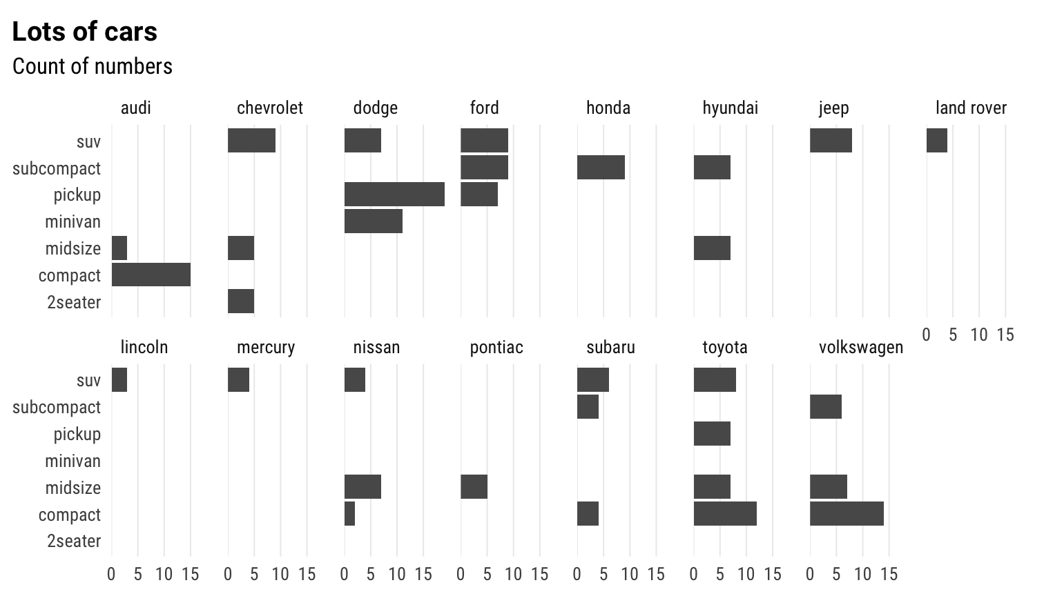
Small mutliples scatter
ggplot(mpg) +
 geom_point(aes(cty, hwy), alpha = .2) +
 theme_schola("scatter", multiplot = T) +
 labs(title = "Lots of cars", subtitle = "Point by point") +
 facet_wrap(~ class, nrow = 2)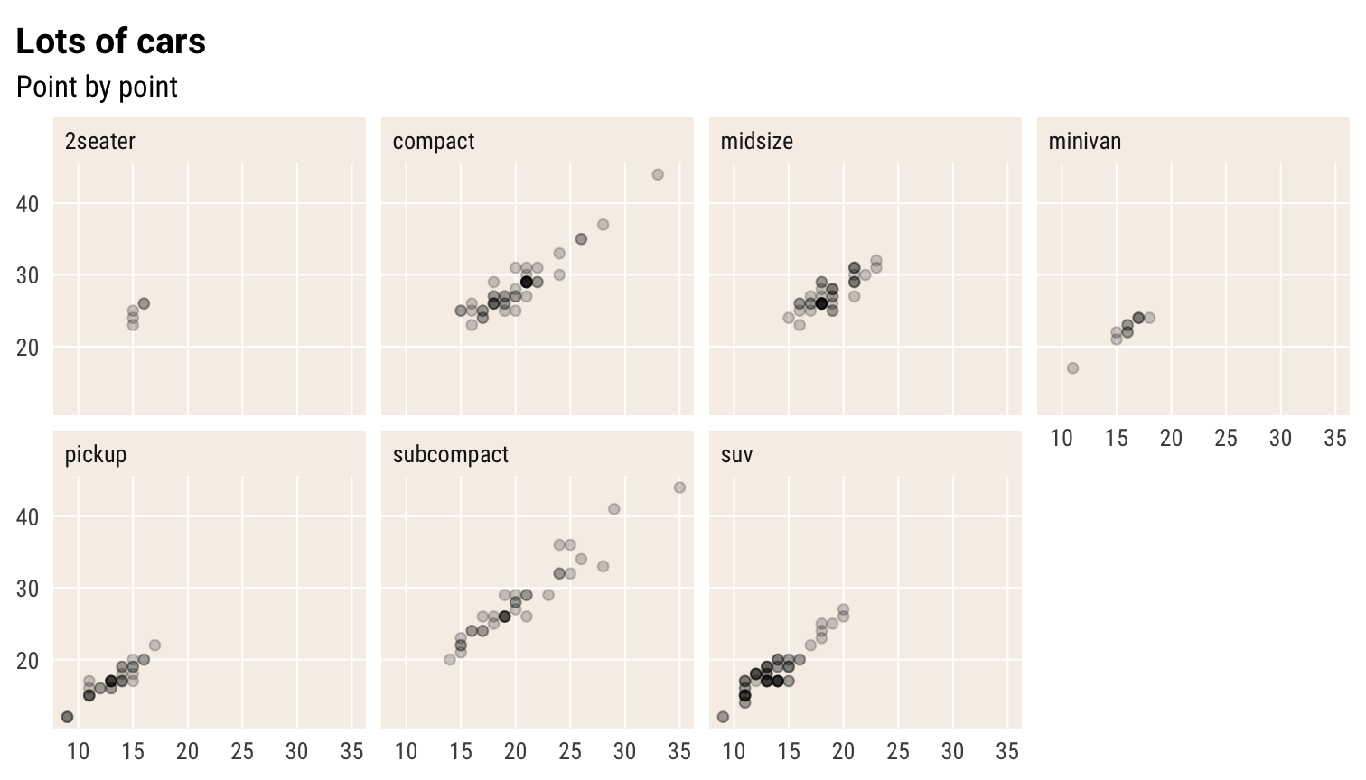
Small mutliples grid
p +
 theme_schola("x", multiplot = T) +
 scale_x_continuous(expand = flush_axis) +
 facet_grid(cyl ~ drv)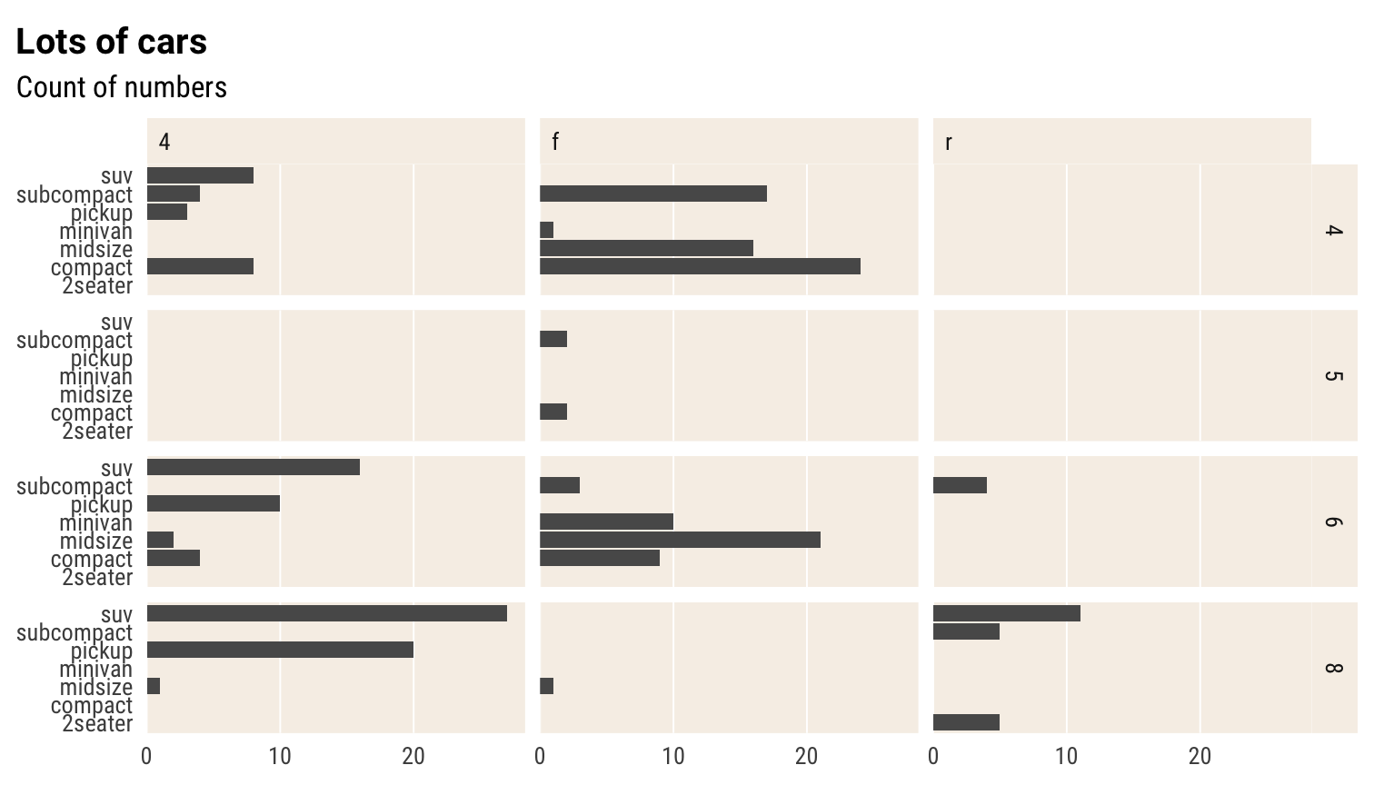
Small mutliples scatter grid
ggplot(mpg) +
 geom_point(aes(cty, hwy), alpha = .2) +
 theme_schola("scatter", multiplot = T) +
 labs(title = "Lots of cars", subtitle = "Point by point") +
 facet_grid(cyl ~ class)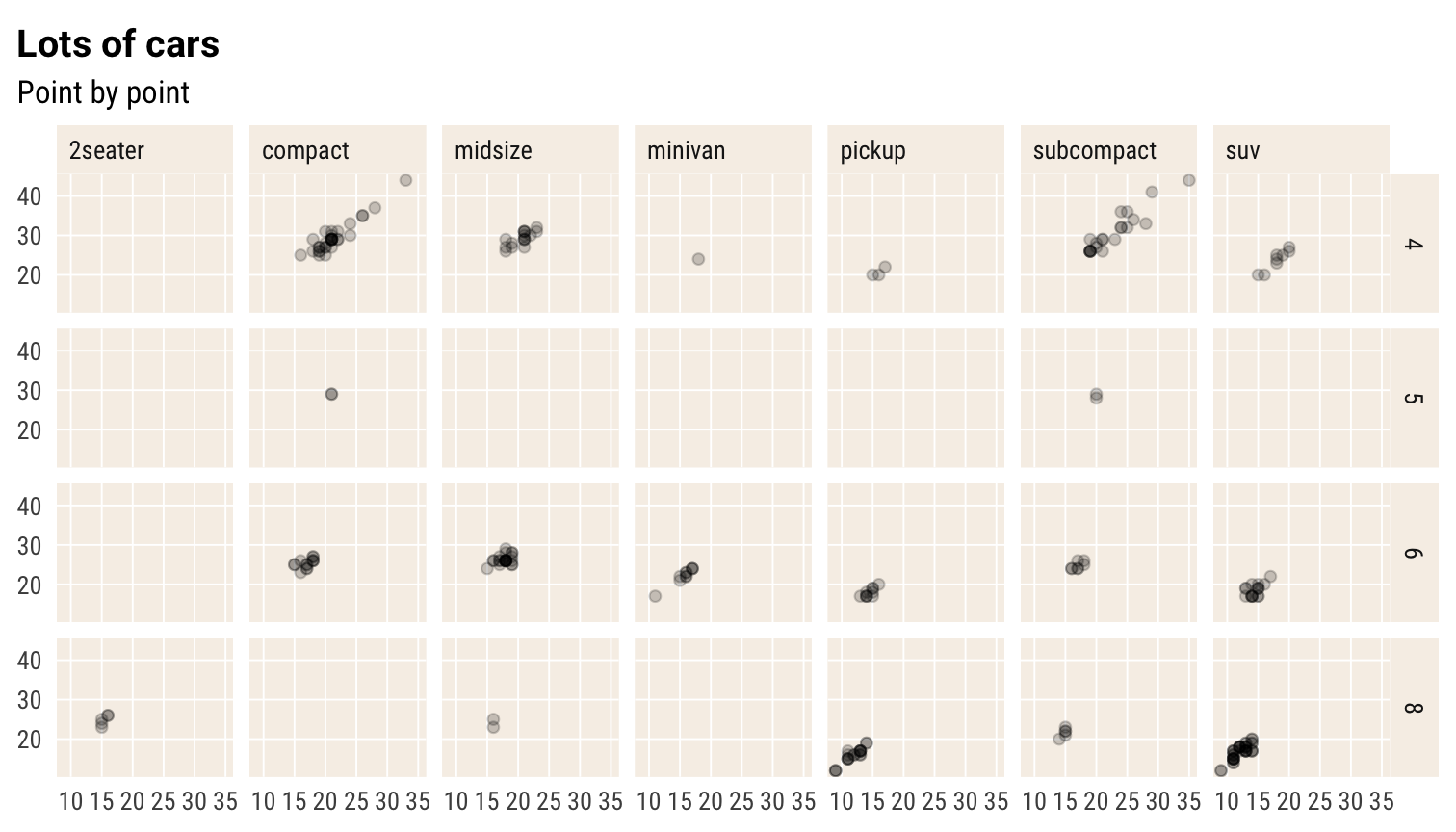
Same but without multiplot parameter
ggplot(mpg) +
 geom_point(aes(cty, hwy), alpha = .2) +
 theme_schola("scatter", multiplot = F) +
 labs(title = "Lots of cars", subtitle = "Point by point") +
 facet_grid(cyl ~ class)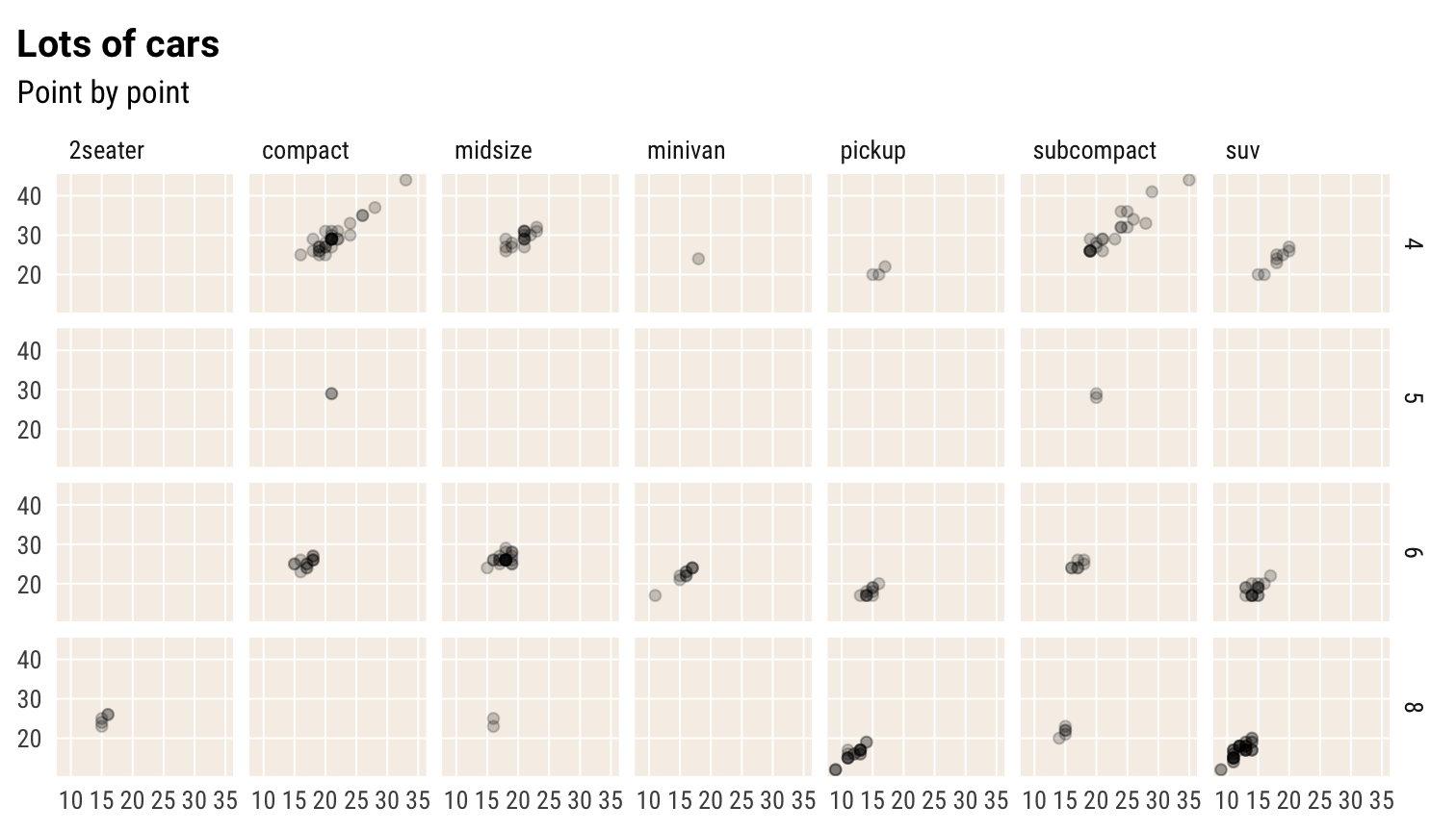
Using custom numeric scales
The chartb below illustrates the custom scales
ggplot(mpg, aes(hwy * 100, cty/max(cty))) +
geom_point(aes(colour = cty/max(cty), size = hwy*100)) +
theme_schola() +
scale_y_percent_cz() +
scale_x_number_cz() +
scale_color_binned(labels = label_percent_cz()) +
scale_size_binned(labels = label_number_cz())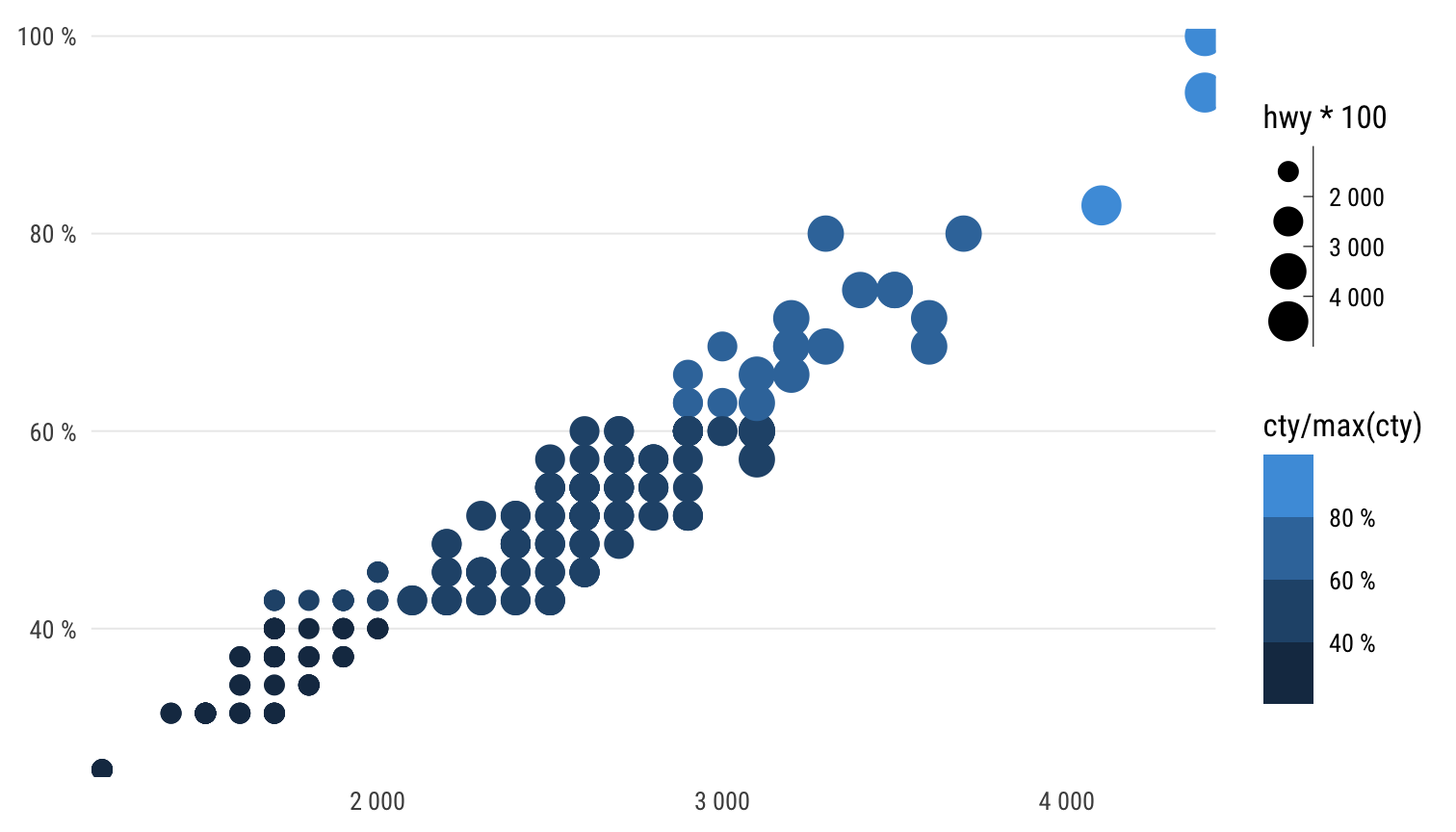 The percent formatter and number formatter also handle the decimal mark
correctly. The parameters which you would normally find inside the
scales::format_*() functions are accessible directly in the
scale_[xy]_continuous() functions.
ggplot(mpg, aes(hwy / 100, cty/max(cty)/100)) +
  geom_point(aes(colour = cty/max(cty), size = hwy*100)) +
  theme_schola() +
  scale_y_percent_cz(accuracy = .1) +
  scale_x_number_cz(accuracy = .1) +
  scale_color_binned(labels = label_percent_cz(accuracy = .1)) +
  scale_size_binned(labels = label_number_cz(accuracy = 0.1))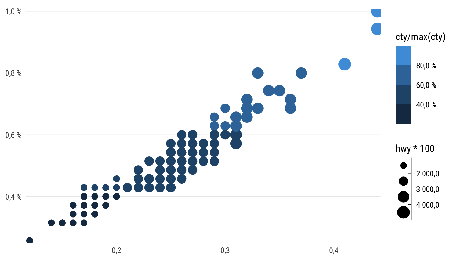
An English-locale version would look like this, using functions in
scales or reexported from hrbrthemes:
ggplot(mpg, aes(hwy * 100, cty/max(cty))) +
  geom_point(aes(colour = cty/max(cty), size = hwy*100)) +
  theme_schola() +
  scale_y_percent(accuracy = .1) +
  scale_x_comma(accuracy = .1) +
  scale_color_binned(labels = scales::label_percent(accuracy = .1)) +
  scale_size_binned(labels = scales::label_number(accuracy = .1))
Sizing images
The schola_[word|pdf] formats have opinionated sizing
defaults to ensure that resolution, size and font size in the bitmap
(PNG) image are in line with the rest of the document. This is
particularly tricky in the context of Word documents, hence the baked in
defaults. For this reason, the steps to change images sizes are a bit
special - see below.
Here is what the defaults are:
- width is full-page, i.e. 15.98 cm (so the image is sized exactly to fit inside margings without any resizing which would degrade quality)
- resolution at 300 DPI and pixel size to result in sharp image with exactly same font size as document
- height is width divided by the golden ratio, i.e. default height is 9.92 cm
Here is how to manipulate image sizes without messing up anything else, in Word:
- to change the height, set the
fig.aspchunk option to more or less than 0.62 - to change the width, set chunk options
fig.widthandout.widthto the same size in centimeters, e.g. for half-width you would dofig.width=7.98/2.54, out.width="7.98cm"(becausefig.widthis set in inches). Note the quotes around theout.widthvalue - this is a special thing for pandoc to ensure the sizing is reflected in the layout of the Word document. The height in this case will be 7.98 * 0.62 cm (see above) - so to change both width and height, set the
fig.aspparam as per above.
For HTML output, you can use
e.g. out.width="50%".
For PDF output, you can just set
fig.width in inches and the height using
fig.asp as above, as long as you use the pdf
or cairo_pdf device (using the dev option in
the chunk or at per-document level.) Note that the font handling might
be a bit tricky for PDF depending on your system.
Image sizing works quite differently between output formats (HTML, PDF, Word). For that reason it is probably the one thing that will look odd or break if you try to render a document written in a reschola template into HTML or PDF without fiddling with sizing, graphic devices or font handling.
Making fonts work
The schola_theme() is set to use the Ubuntu and Ubuntu
Condensed font families by default. These may not be present on your
system. You can install them with
reschola::install_reschola_fonts() and by running
reschola::register_reschola_fonts() (only needed on Windows
if you use Windows bitmap devices – which are default). On package load,
these will be registered with R. If the fonts do not show up in your
charts, run extrafont::loadfonts() (once per session). You
can also set the option reschola.loadfonts to have
reschola register these fonts with the PDF/PostScript
ecosystem upon package load. (The fonts may or may not work out of the
box when you render into PDF depending on your system – if not, first
try using the cairo_pdf device and/or running
extrafont::embed_fonts() on the whole resulting PDF
document.)
Using fonts
If you end up using different fonts, it is good to choose something that (a) has fixed-width figures in the default set of characters, and (b) has sensible widths or a narrow-width member of the type family (usually called “Condensed”, “Narrow” or some such.)
The hrbrthemes package has a good range of fonts, some
of which tick these criteria. Arial Narrow is narrow and has fixed-width
figures. IBM Plex Sans, Titillium Sans and Econ Sans all have fixed
width figures but not all have Narrow companions.
Public Sans does not have fixed-width figures.
See the hrbrthemes vignette for an explanation of why these criteria matter
Tricks of the trade for ggplot2
-
theme_void()for visuals that don’t need any gridlines, axes, etc., such as schematic maps - aes(…, group = 1) for making all data points in a
geom_line()into one line -
key_glyphparameter to geoms to pick a specific shape for the legend key -
geom_sf_labelfor intelligently labelling spatial features plotted throughgeom_sf() -
labs(colour = NULL)for switching off the colour legend,labs(x = NULL)to turn off colour label - quicker thantheme(axis.label.x = element_blank())andguides(colour = "none")
Resources on good practice
Kieran Healy. Data Visualisation: a practical introduction. With R code.
Claus Wilke. Fundamentals of Data Visualisation No R code, very strong on principles.
Beyond that and in the world of paper books, anything by Alberto Cairo is solid.
Handy (or just cool) ggplot2 extensions
Crucial
-
patchworkfor combining multiple plots into one in a simple, intuitive way, while merging legends and aligning everyhing as needed -
ggraphin combination withtidygraphfor network data -
ggcorrfor correlation matrices -
GGallywith a set of utilities, incl.GGally::ggpairs() -
sjPlotalso provides useful visual forms, most usefully the visual and tabular summaries of model results
Useful
-
ggtextfor formatting pretty much any text in a ggplot using Markdown/HTML -
ggiraphfor basic web interactivity -
ggforcefor cool annotation -
ggrepelfor handling overlapping labels -
gghighlightfor highlighting individual points/series -
ggmosaicfor mosaic plots -
ggalluvialfor Sankey diagrams -
wafflefor waffle (square pie) charts incl Isotype-style charts using icons